Borderlands is a name that currently stands as a pillar of the looter-shooter genre, but its path to legendary status was nearly derailed by a generic visual identity. In the late 2000s, the gaming landscape was saturated with gritty, desaturated military shooters that favored brown and grey palettes over vibrant personality. During a pivotal moment in development, the decision was made to scrap the existing realistic aesthetic in favor of the iconic, comic-book-inspired look we recognize today, a move that fundamentally altered the trajectory of the entire franchise.
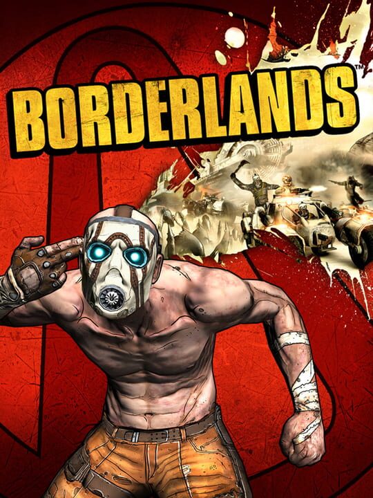
▲ Official Cover Art (Source: IGDB)
| Feature | Details |
|---|---|
| Primary Focus | Borderlands Visual Identity Overhaul |
| Development Cost | $50 Million USD |
| Time Investment | 1 Additional Year |
| Original Style | Realistic, Gritty, “Brooding” |
| Final Aesthetic | Stylized, Ink-Lined, Comic-Book Inspired |
The High Stakes of the Borderlands Visual Overhaul
The decision to pivot the art style of Borderlands came at a point when the game was technically almost finished. Originally slated for release within a two-month window, the project looked drastically different—more akin to the realistic grit of contemporary titles like Fallout 3 or Rage. Recognizing that the game lacked a distinct “hook” in a crowded market, leadership opted for a massive gamble. This wasn’t just a minor texture swap; it was a total reimagining that required an additional year of development and an estimated $50 million in capital.
For players, this shift was the difference between a forgettable shooter and a cult classic. The stylized visuals did more than just look pretty; they allowed for much higher visual clarity during chaotic combat sequences. When you are managing dozens of elemental effects, loot drops, and varied enemy types, a realistic art style often becomes a cluttered mess. By leaning into bold ink lines and saturated colors, the developers ensured that every piece of loot and every critical hit felt impactful and readable, enhancing the core gameplay loop of the Borderlands experience.
Why Borderlands Needed Its Comic Book Identity
Without this radical shift, the gameplay mechanics of Borderlands might have felt out of place. The franchise is known for its over-the-top humor, absurd weaponry, and eccentric characters. A realistic visual style would have created a jarring tonal dissonance between the “serious” look of the world and the ridiculous nature of the Catch-a-Ride system or the erratic behavior of Psycho enemies. The stylized overhaul allowed the art to match the energy of the writing, creating a cohesive package that players could fully immerse themselves in.
▲ Official Artwork (Source: IGDB)
From a player’s perspective, this investment in style also granted the game incredible longevity. While the realistic shooters of 2009 now look dated and muddy due to technical limitations of that era, the original Borderlands remains visually striking and playable even by modern standards. The stylized approach bypasses the “uncanny valley” and the rapid aging of realistic textures, proving that a unique artistic voice is often more valuable than raw graphical fidelity. For the fans who have spent hundreds of hours in Pandora, that $50 million was a small price to pay for a world that never feels out of date.
Analyzing the Cost of Creativity
When comparing this overhaul to the development of subsequent entries, the scale of the risk becomes even clearer. Historical estimates suggest that the sequel, Borderlands 2, had a development budget in the neighborhood of $35 million. Spending $50 million just to change the look of the first game represents a monumental level of commitment to quality over convenience. It suggests that the creators understood a fundamental truth about the gaming market: if a game doesn’t stand out visually within the first five seconds of a trailer, it risks being ignored entirely by the community.
This massive reinvestment also affected the player’s wallet in a long-term sense by ensuring the franchise’s survival. Had the original game launched in its “grey” state and flopped, we likely would never have seen the mechanical refinements, the expansive DLCs, or the cooperative play improvements that the series is now famous for. The success of the art style allowed for the birth of a franchise that has consistently delivered value to looter-shooter fans for nearly two decades. It serves as a case study for why developers should trust their instincts when a project feels “indistinct,” even if the financial cost of a pivot is staggering.
The Borderlands gamble proves that aesthetic is a core gameplay mechanic.
By investing $50 million into a visual overhaul, the developers didn’t just change how the game looked; they changed how it played. The stylized art style provided the necessary visual hierarchy for complex loot management and high-speed combat that realistic graphics simply couldn’t support at the time. This pivot defined the franchise’s soul, proving that distinct personality is the best defense against a saturated market and the inevitable march of technical obsolescence.
Final Pulse Score: 9 / 10